Web Design - Aerial Photography Gallery
DesignGreg, a Hawaii-based aerial photographer and videographer, asked me to design and build a website for him to show off his work. We discussed how his new website would fit into his business, and I created a minimalist website design to serve as an online gallery of his work.
Origin Story
Greg started flying drones to take aerial footage for fun, and the images he posted on social media gained enough traction that he turned his hobby into a business. These days, he covers some of Hawaii’s biggest fishing, boating, and adventure sports events and has production companies knocking on his door to buy rare reels of lava flows.
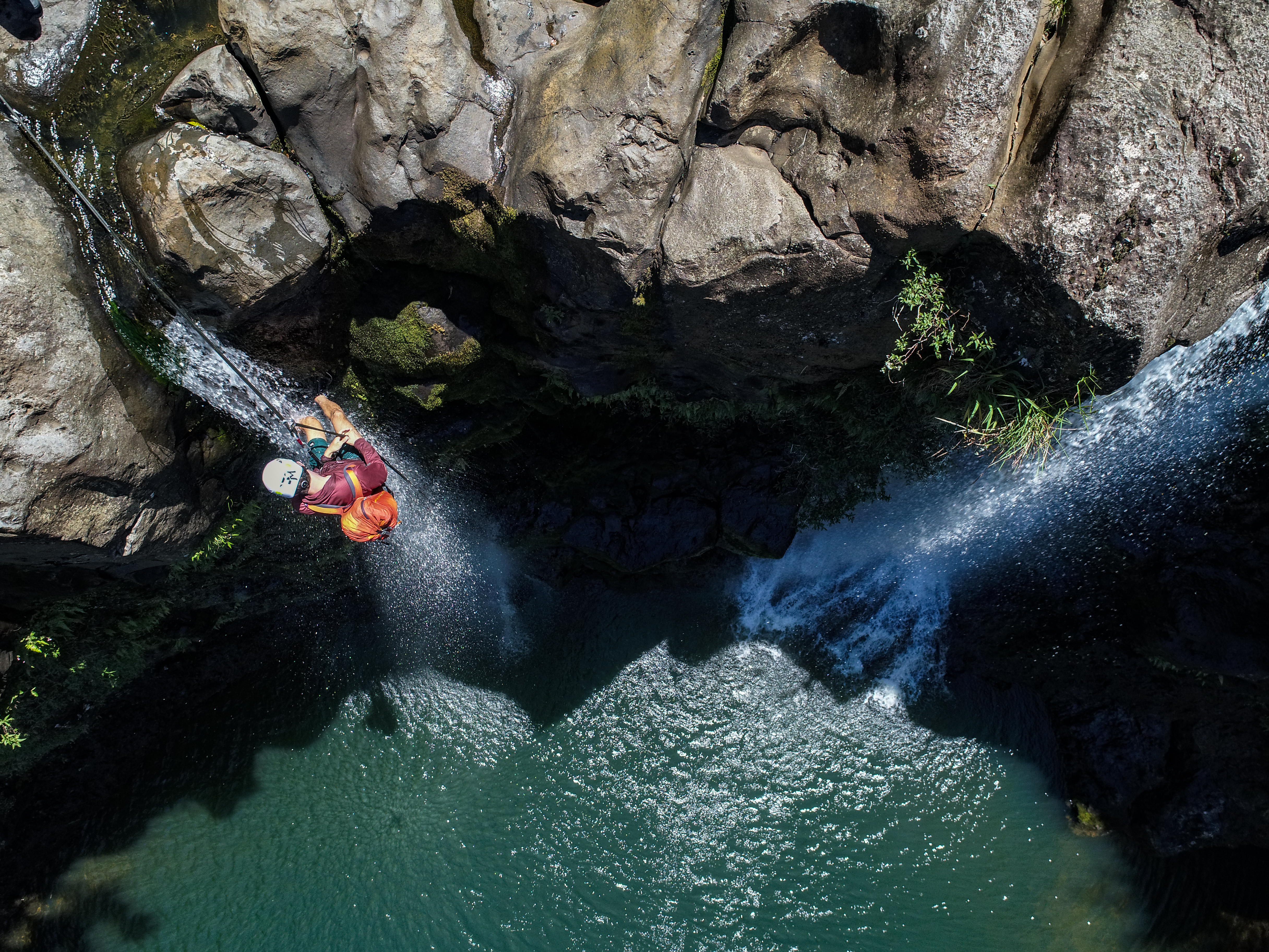
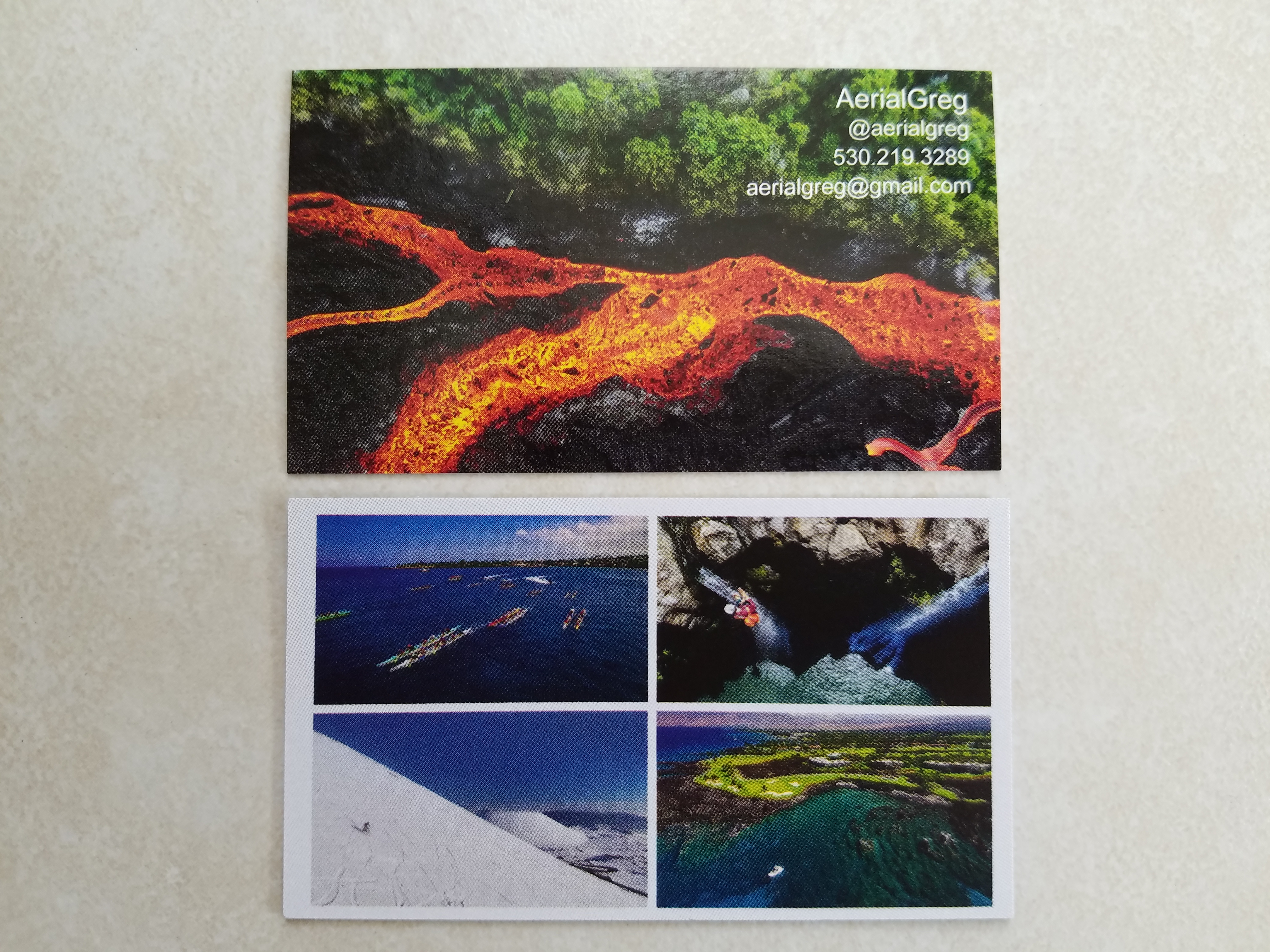
As his business grew, Greg had started attending conferences to showcase his work, and he wanted to be able to send new contacts to an online gallery where his work really shined.
Website Purpose
Understanding Greg’s business was crucial to coming up with a plan for his website. Many photographers are booked for photoshoots with individual customers with no specialized photography knowledge, or make sales on prints of their work. In these cases, I would design a website to serve as an online shop and direct visitors to browse photoshoot packages they could book or print options they could order. However, the majority of Greg’s business was larger, corporate clients. His website would be a tool in building relationships with potential clients, giving them free reign to explore his body of work, follow his most recent social media uploads, or contact him directly to discuss large projects.
To that end, the main purpose of his website was to display his offering of unique, high-quality aerial photography and videography. The secondary purpose was to invite potential clients to follow or contact him.
Content is King
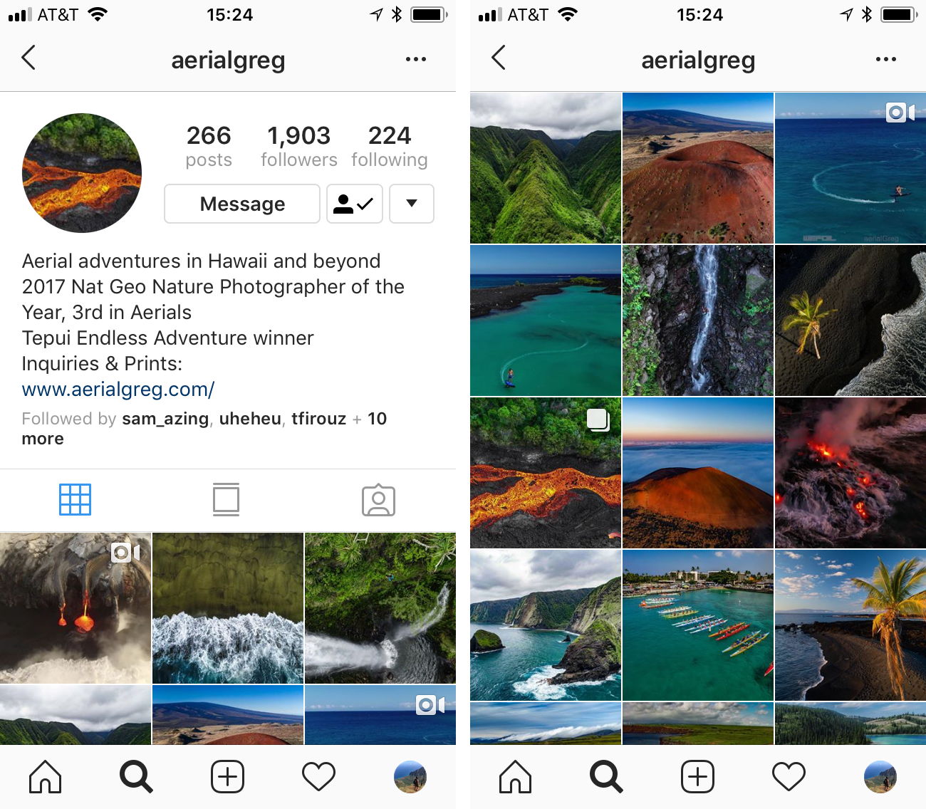
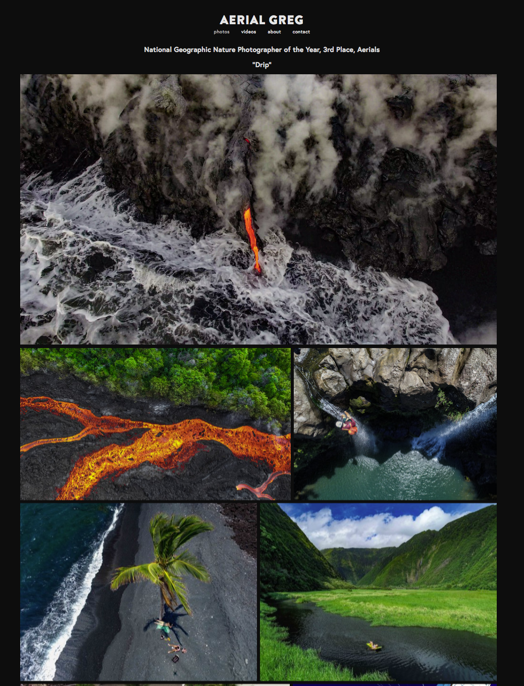
Greg’s photos are vibrant and eye-catching. I loved that his business card and Instagram account let his work speak for itself, so I made design decisions to follow that aesthetic. I put the photos front and center and let the rest of the website fade into the background.
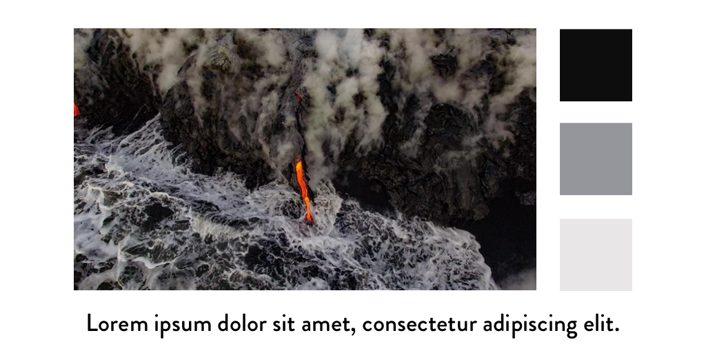
He chose the photo he wanted to be featured first, and I pulled some color ideas from the gray tones in the photo. The neutral, gray scale palette with a dark background made the photos pop, and I picked a modern geometric font with clean lines that wouldn’t distract the eye from the textures in the images.
I used an uncluttered, minimalist design, letting the photos fill the space. The only text besides a logo and a few menu items was a line noting an National Geographic award Greg had won. This recognition from an authoritative source would showcase his artistry and professionalism.
Call to Action
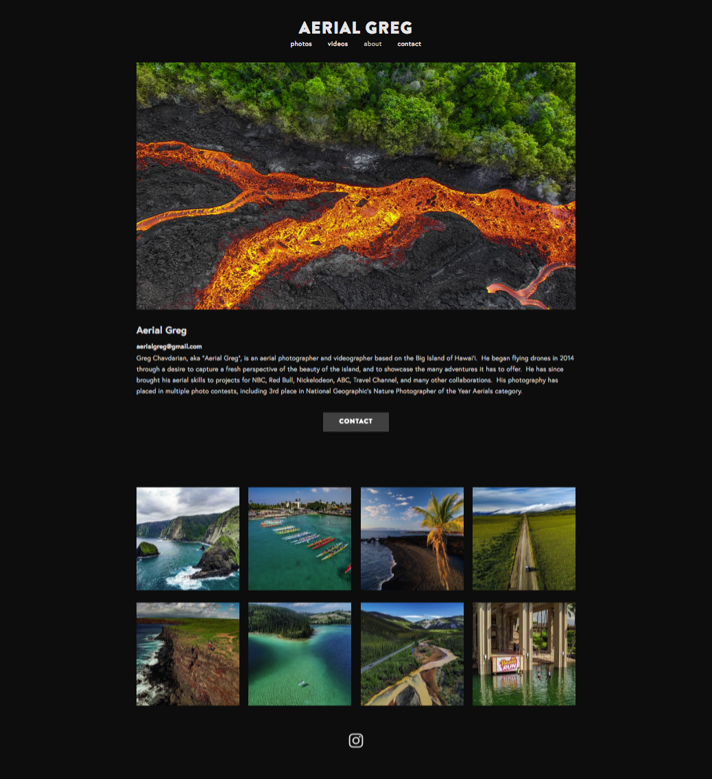
In order to encourage engagement from the website visitors, each page included a feed of his most recent photos posted to Instagram as an invitation to follow his latest work. If visitors followed him, Greg could share new content over time to build a relationship with them, even if they weren’t ready to hire him yet. If a visitor to his website was ready to discuss a job with him, both his About and Contact pages had “Contact” buttons as clear calls to action.
Overall, I designed Greg’s website to work in harmony with the slower sales cycle for his business. Instead of a storefront, his website is an elegant gallery.
